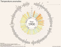
Last year, there was the temperature spiral. This year, it’s the temperature circle that’s making the trend of global warming crystal clear.
A new video shows the rhythm of global warming for countries around the world, from Afghanistan to Zimbabwe. Bars representing each country’s annual average temperature anomaly pulse up and down. It's like watching a heartbeat on a monitor.
Rather than staying steady like a normal heartbeat, it’s clear that temperatures for more than 100 countries are climbing ever higher on the back of increasing carbon pollution. While there are individual variations in how hot any year is, the signal of climate change is unmistakable.
“There are no single countries that clearly stand out from the graph,” said Antti Lipponen, a physicist at the Finnish Meteorological Institute who made the graphic. “The warming really is global, not local.”
Read original at A History of Global Warming, in Just 35 Seconds

No comments:
Post a Comment